
Repost from Elle Decor - Written by Sara Tardiff on Dec 7, 2017
THESE ARE THE COLORS EVERYONE WILL BE TALKING ABOUT IN 2018
There's a new minimalist color palette in town, and it doesn't involve grey.
It's time to discuss which home decor trends will define the year to come. While 2017 was all about tropical green, warm neutrals, and sophisticated camel accents, we predict that 2018 will be full of even edgier hues.
If you need some help imagining how they might play out in your own space, look no further than the 7 rooms below.
 |
| Graham & Brown |
SOPHISTICATED BLUSH
Graham & Brown's 2018 pick is Penelope, a shade of dusty rose that reimagines neutral home styling. This barely-there color combines the simple chic of ecru and the vivacity of a classic pink.
VIBRANT, DEEP RED
Benjamin Moore picked the vivid Caliente as their color of the year. This lively shade of red is designed to stand out, but an accent wall in this fiery color can help energize and harmonize a space.
SHADES OF PURPLE
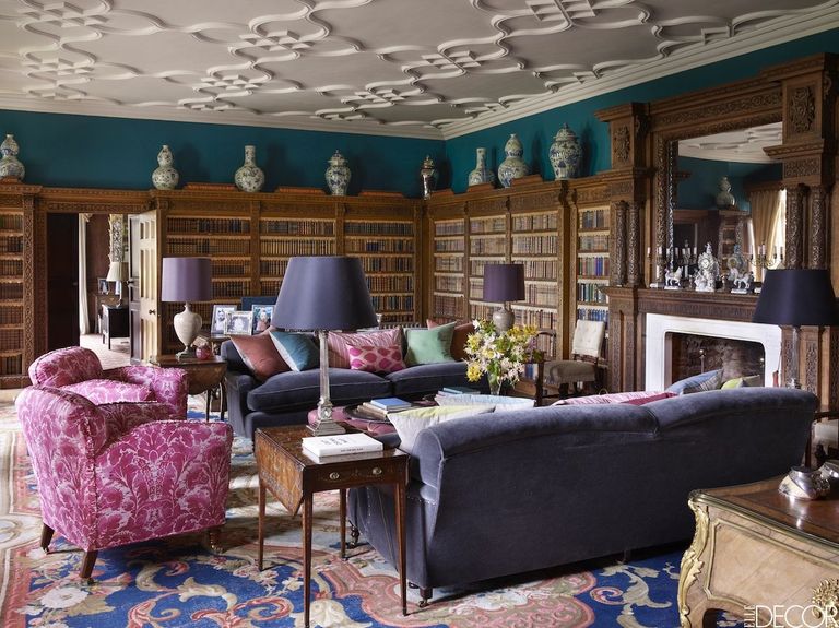
Pantone named Ultra Violet the 2018 Color of the Year, and it's easy to see why. This rich, thoughtful shade of purple adds energy and depth to any room. Whether you're adventurous enough to commit to an all-purple color scheme, or prefer to experiment with home accessories first, this complex hue is one to watch.
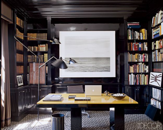
BLACK AS A STATEMENT COLOR
There's no denying we're in love with
all-black rooms, and 2018 is totally onboard with the sleek and sexy trend. According to
Trendir, black should be treated as a neutral this year, considering it complements nearly any theme or color palette. From black floors to black chandeliers, it is the perfect way to add some drama to your space.
 |
| Sherwin-Williams |
MINIMALIST PASTELS
Black-and-white interiors had their time to shine, but 2018 is ready to give way to a new minimalist palette. Soft, washed pastels like mint greens and sandy pinks will totally reimagine simple modern design in the coming year, according to
Sherwin-Williams.
“Sincerity is about mindful living and
creating an environment to disconnect and recharge," says Sue Wadden, Sherwin-Williams' director of marketing. Soft, washed neutrals, greens and sanctuary pinks work together to create harmony.
PINK AS A POWER COLOR
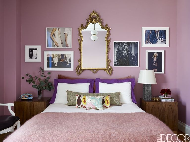
It's official: pink is losing it's gendered connotations. It evokes so many feelings that everyone can relate to, from joy to lust, making for the perfect mood-enhancing paint color.
Pantone predicts that 2018 will the year millennial pink shape-shifts into a stronger, more complex version of itself. "Pink has developed more power than ever before," said Leatrice Eiseman, the Pantone Color Institute's executive director.
 |
| Behr |
SERENE SHADES OF BLUE
An overwhelming trend for decor in 2018 appears to be creating tech-free sanctuaries, where you actually find a little relief in unplugging and actually
relaxing.
Behr's first-ever Color Of The Year, appropriately called
In The Moment T18-15, is a casual and calm blue that immediately makes you feel more at peace.
"In The Moment speaks to our society's desire to disconnect and be present," said Erika Woelfel, vice president of color and creative services at
Behr. "It crosses multiple design styles — global, coastal, modern — and pairs well with other
subdued colors to create harmony for interiors or exteriors."
 |
| Simon Upton |
VIBRANT YELLOWS AND GREENS
Filling your home with vibrant colors shouldn't be considered a design risk, and in 2018, Pantone predicts that it won't be. In their Playful color scheme, you'll find shades like vibrant yellow and lime popsicle that will bring you a childlike joy."People need to stop and smile," said Eiseman. Design doesn't always have to be so serious!
PALETTES INSPIRED BY TRAVEL
Thanks to social media, everyone seems to be talking about travel. Even if you aren't a regular jet-setter, you can still draw color inspiration from around the world. If you live in California, it doesn't mean your palette needs to be nature-inspired or if you're a New Yorker, you have to embrace industrial-inspired shades. In fact, we predict this year is going to be all about going against the grain in terms of color choices.
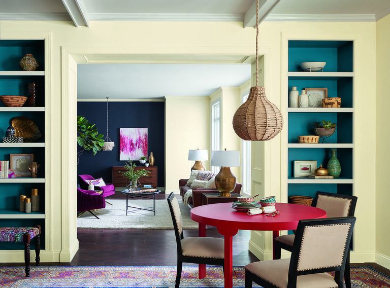
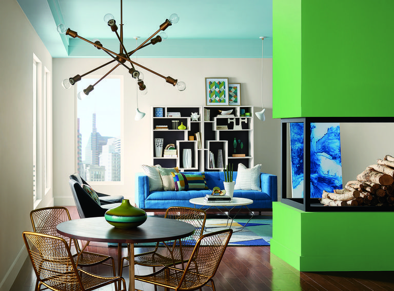
Sherwin-Williams' color story Unity, pictured here, is inspired by the connection of people and places. It beautifully pairs unexpected colors like striking blue, animated fuchsia, and creamy yellow.
METALLICS AS NEUTRALS
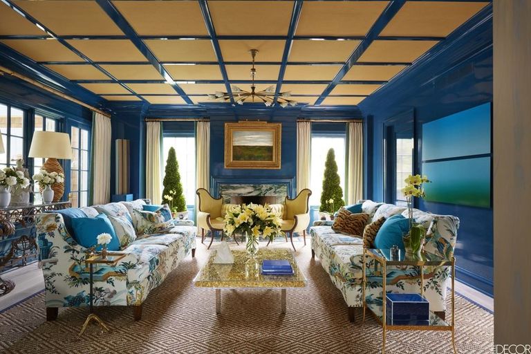
According to Pantone, metallics are no longer a dramatic color choice. In fact, they're part of the "new neutrals" for 2018, says Eiseman. Whether your choose to inset your ceiling with gold paper, like the room pictured here, or add a few
gold accessories throughout your space, apparently gilded is the new white marble.
TECH GREEN
“In Silicon Valley, Austin, Berlin and Beijing, techies are the new hippies, full of breakthrough ideas and utopian ideals,” Wadden of Sherwin-Williams says. “Connectivity is modern and playful, bringing in dark watery tones of blue that are
balanced with neutrals, warm yellow and energetic purples.” Get tech-friendly, not just with your smart home devices, but your color choices, too!





No comments:
Post a Comment